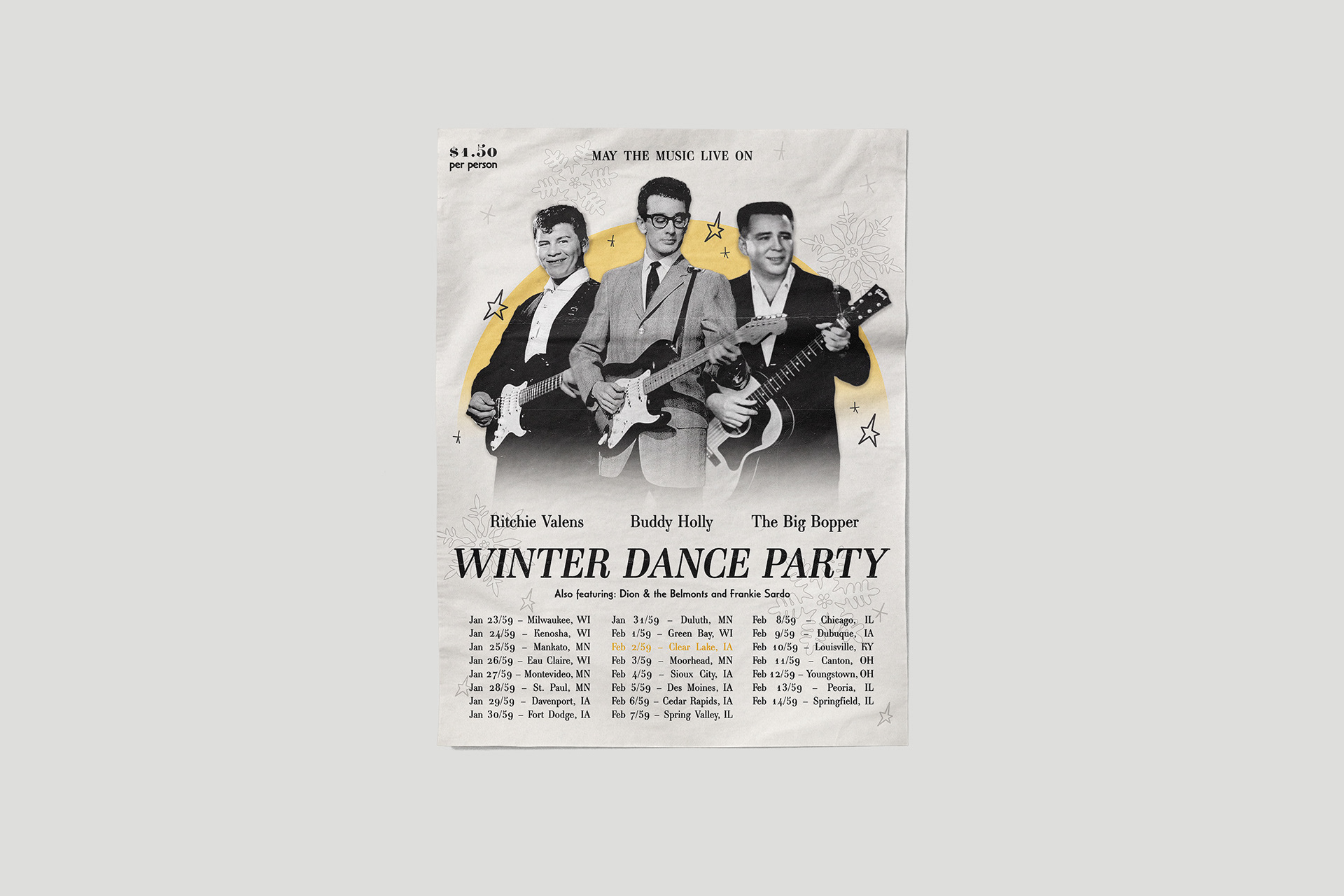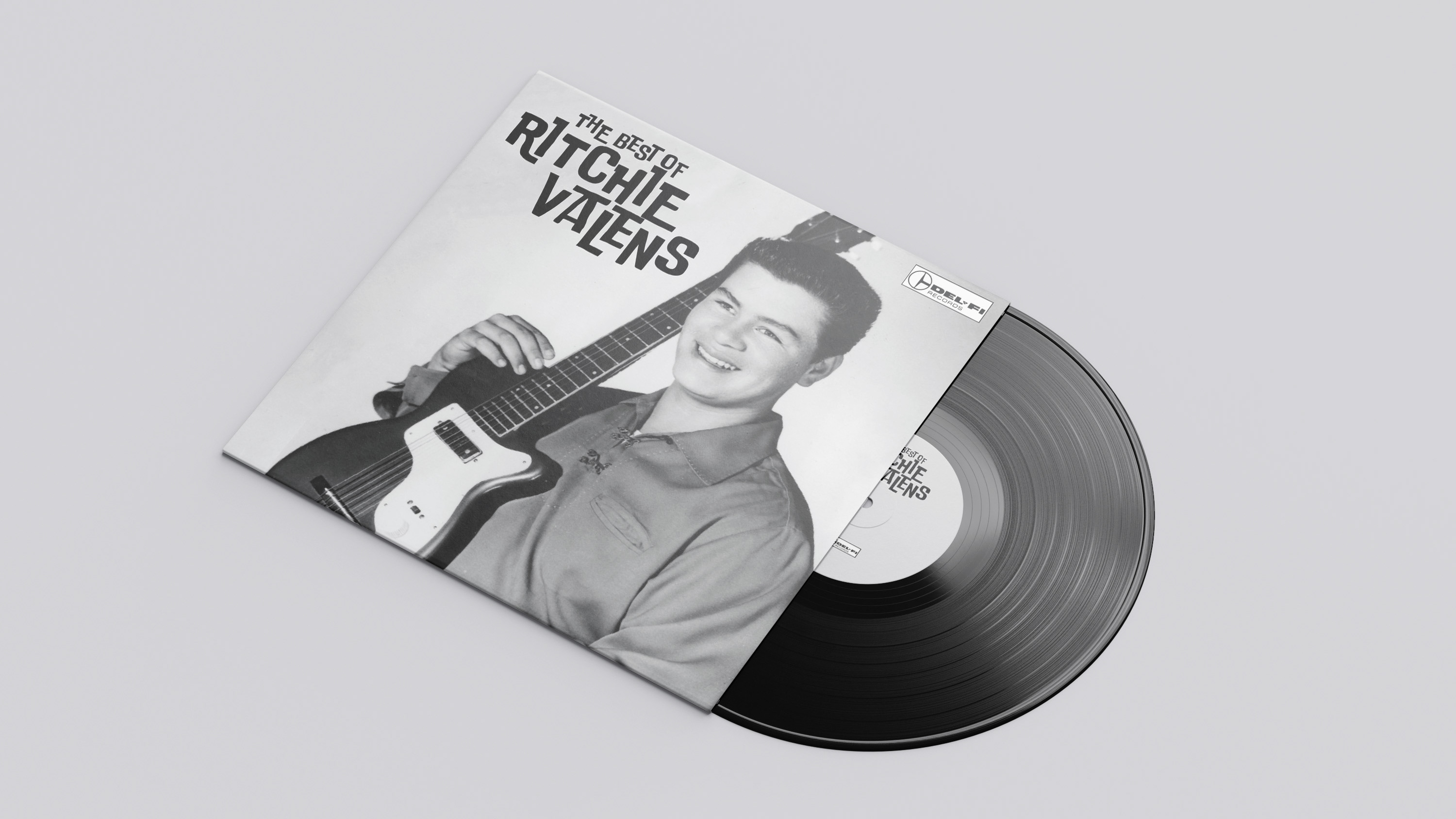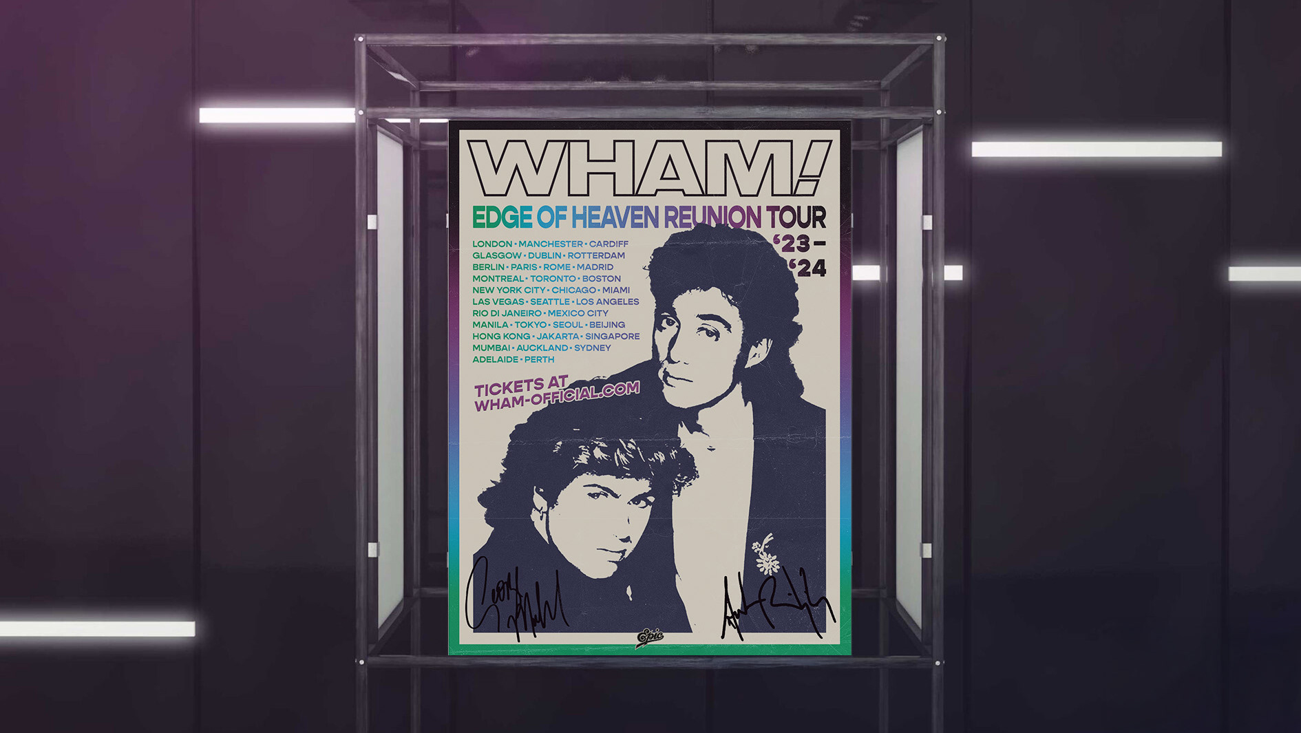
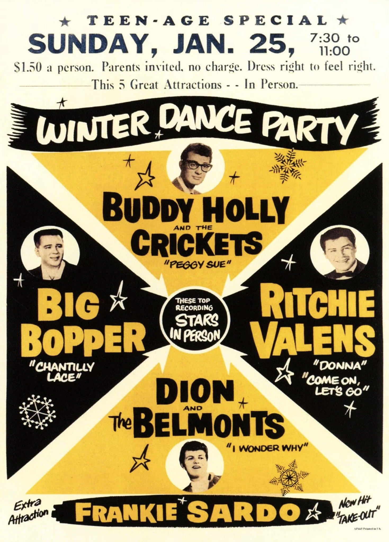
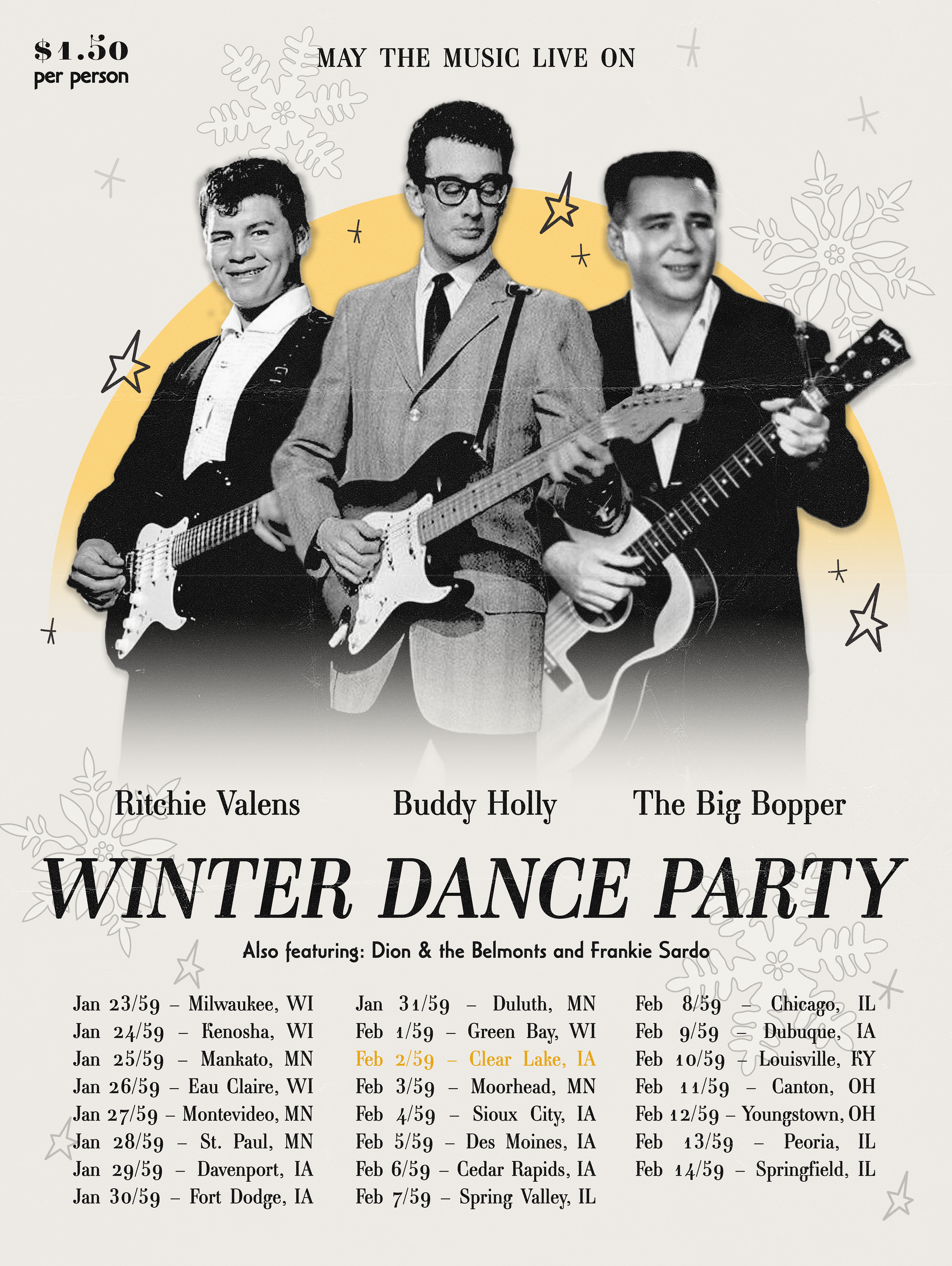
As someone who is interested in history, music, and design, I took this project as an opportunity to merge my passions into one. I began by taking a famous 1950s tour poster and picking out the key pieces of information so as to be able to create a more minimal style as we see in our modern day. The thick, bold shapes and typography were exchanged for calmer colours and a slimming serif font. I wanted to keep the added details of the doodled stars and snowflakes from the 1950s poster as an homage to the original design.
For those of you who know music history, you will know why I called out Feb 2/59 in colour. May the music live on!