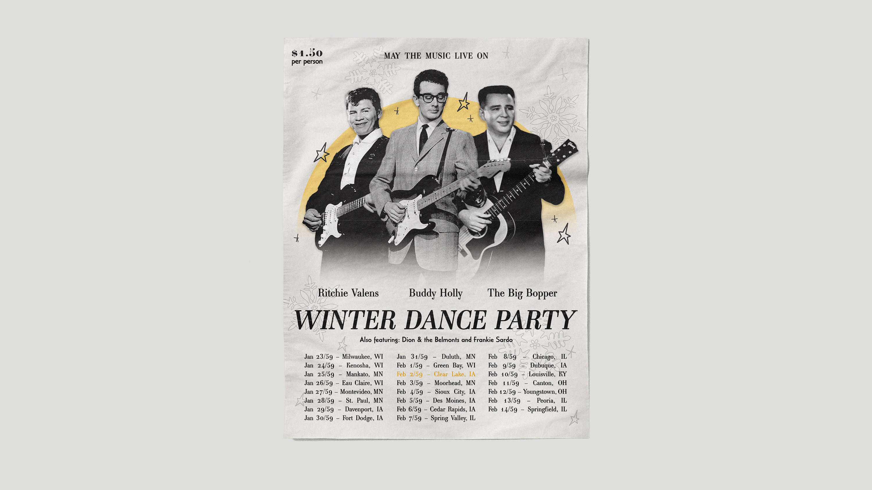
Inspired by the Art Deco movement of the early 20th century and the Swiss Style movement of the mid-20th century, I challenged myself to blend my passion for history, design, and music into one. In doing so, I created a series that allowed me to delve into the study of historical movements through the application of turning back the clock on the modern works of Taylor Swift.

Style 1: Art Deco
Art Deco captivated my interest with its use of ornate decoration and its classic yet simplified figures. Despite the simplicity of the subject in my poster, it took a lot of time and attention to detail to get everything on the dress just right – knowing that lavish ornamentation is an important characteristic of the Art Deco style. I kept the use of gold consistent to allow it to pop against the dark, moody background and made sure I choose typefaces that expressed the Art Deco type period in its sans-serif classification and decorative detailing. Of course, I couldn’t forget an ornate gold geometric frame around the composition that is often so present in Art Deco designs.
Style 2: Swiss Style
In comparison to my Art Deco poster’s ornate detail, this Swiss Style poster is the striking opposite. This style is very focused on grid alignment and text focused compositions, being generally devoid of decoration. I kept my ‘images’ as simple shapes while colour is often used fleetingly in this style, so I focused on a more simplistic colour scheme rather than something more detailed. Standard sans-serif type has been used, making sure that it seems to pop off the light background. Most of my type is left justified with ragged right edges with an exception to the bottom right text which needed the opposite for sake of balance. Swiss Style tends to get its theme across with words rather than decoration, so I made sure to include some more type than illustration in this poster to emulate that.


Style 3: Combination of Art Deco and Swiss
Finding the balance between the ornate Art Deco style and the simplistic Swiss Style proved difficult but my third and final poster in this series, I believe, summarizes both quite well. Referencing the Swiss Style, I kept my background simple and my top type in that simple, strong bold type face that has that flush-left-ragged-right alignment similarly to my second poster in this series. For the Art Deco side of this design, I kept my focal image within that simplified style that is often seen in that era and tied it together with a splash of that same maroon colour along the bottom to ground my image. I also used Art Deco inspired decorative type for the main title as well as the dividing lines that are seen throughout the poster. At first glance, this poster may appear as one unity, but being able to pull out the characteristics that show it is a mix of two distinct areas is key.