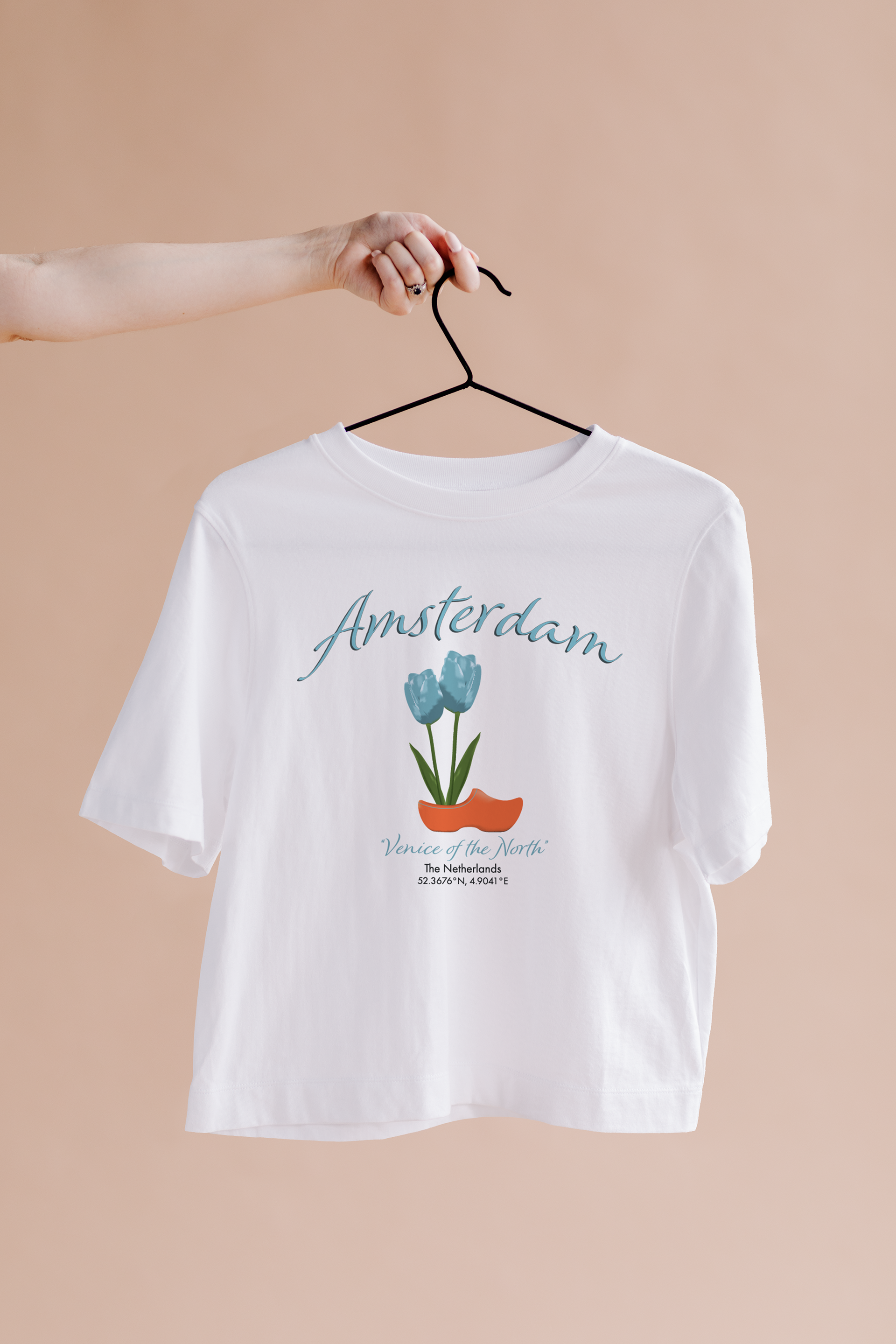
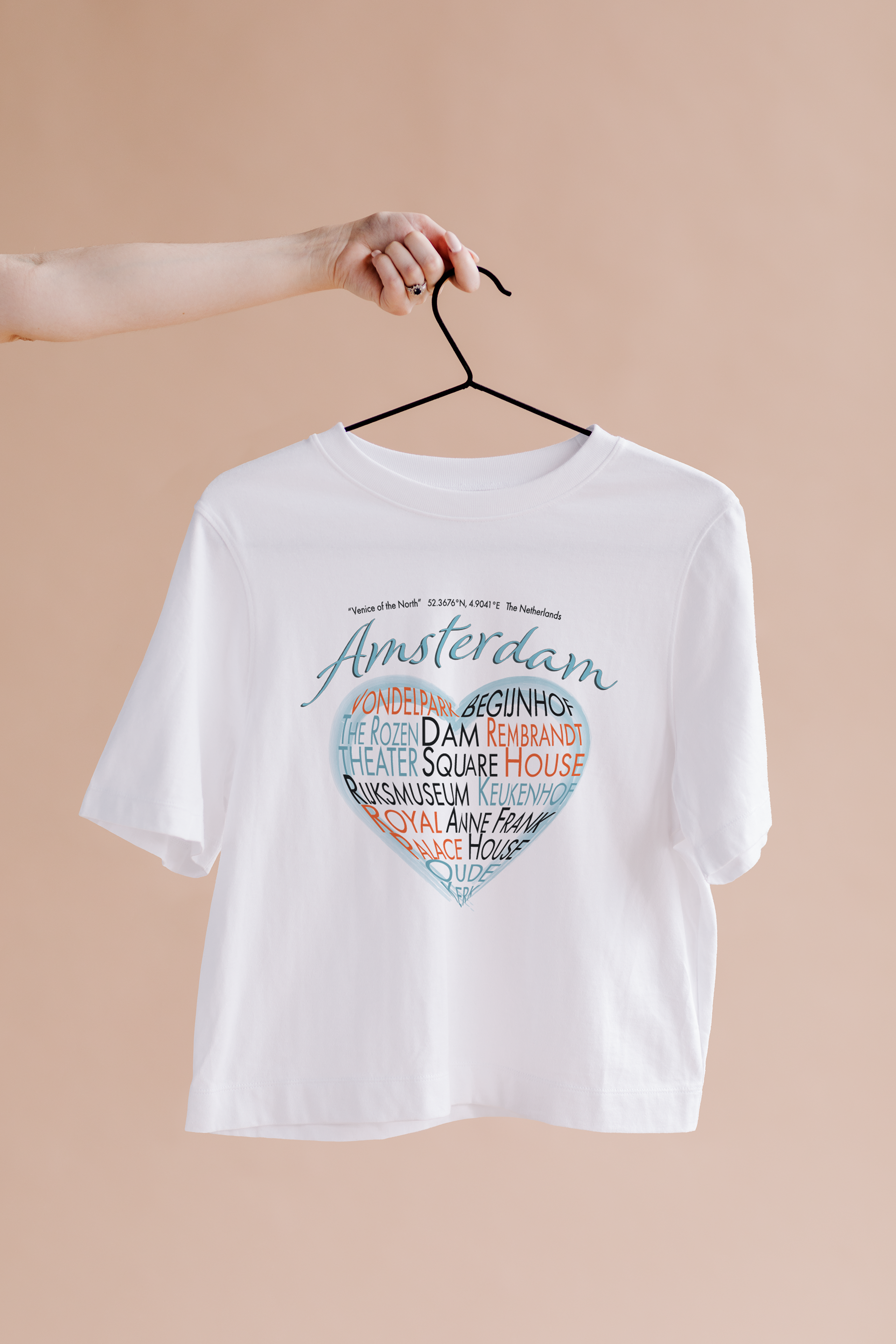
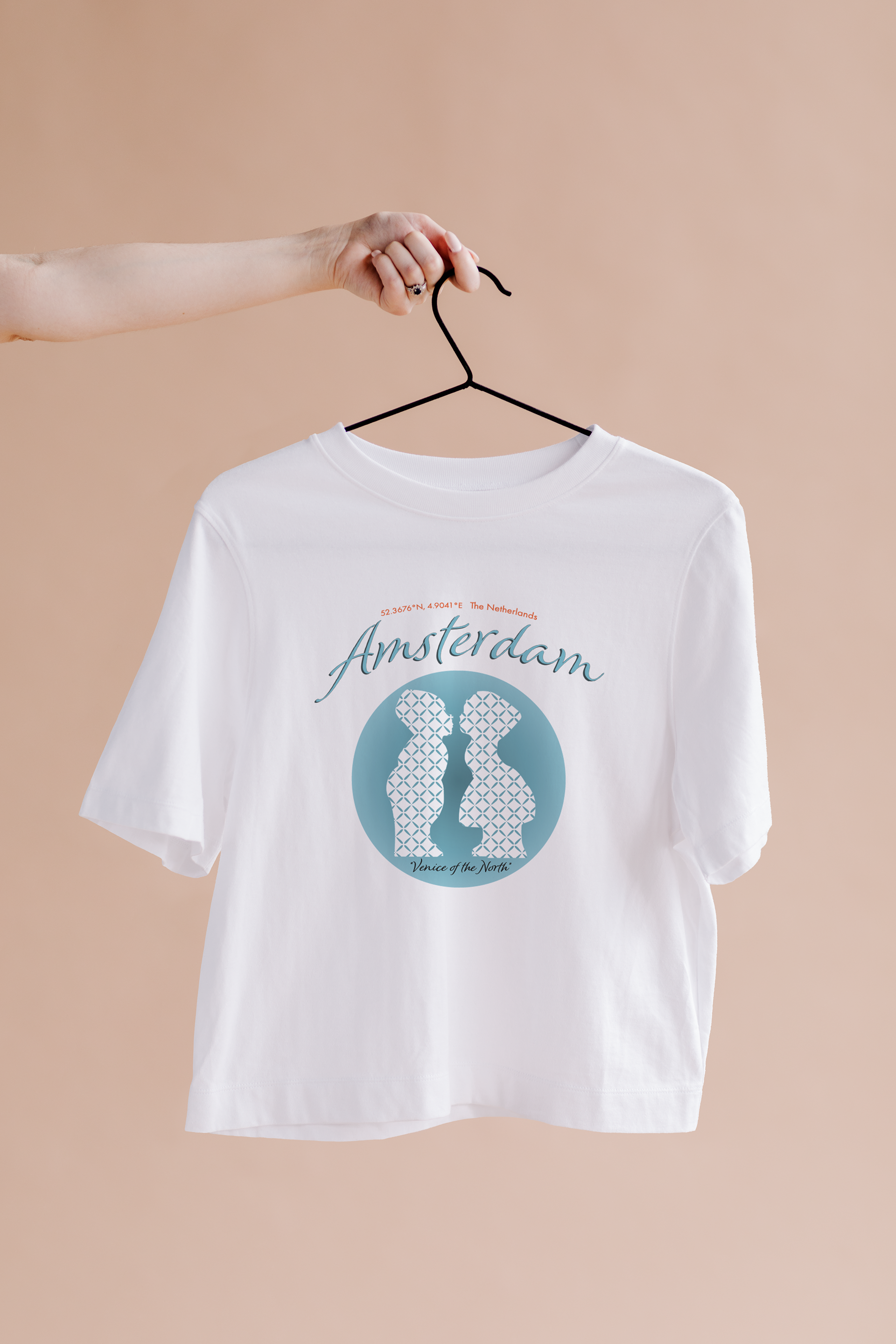
This project consisted of designing a consistent style and brand for an ad campaign encouraging tourism to the city of Amsterdam. Specifically, my target audience were young adults who were looking for a place to honeymoon and who would be drawn to the natural beauty and rich history that Amsterdam and her surrounding areas had to offer. From postcard design to t-shirt designs to website mockups, this project acted as a way for me to practice my skills in various design programs while also being able to create a unified brand across various interfaces and materials.
