2 Teams. 128 Career Races. 711 Career Points. 8 Fastest Laps.*
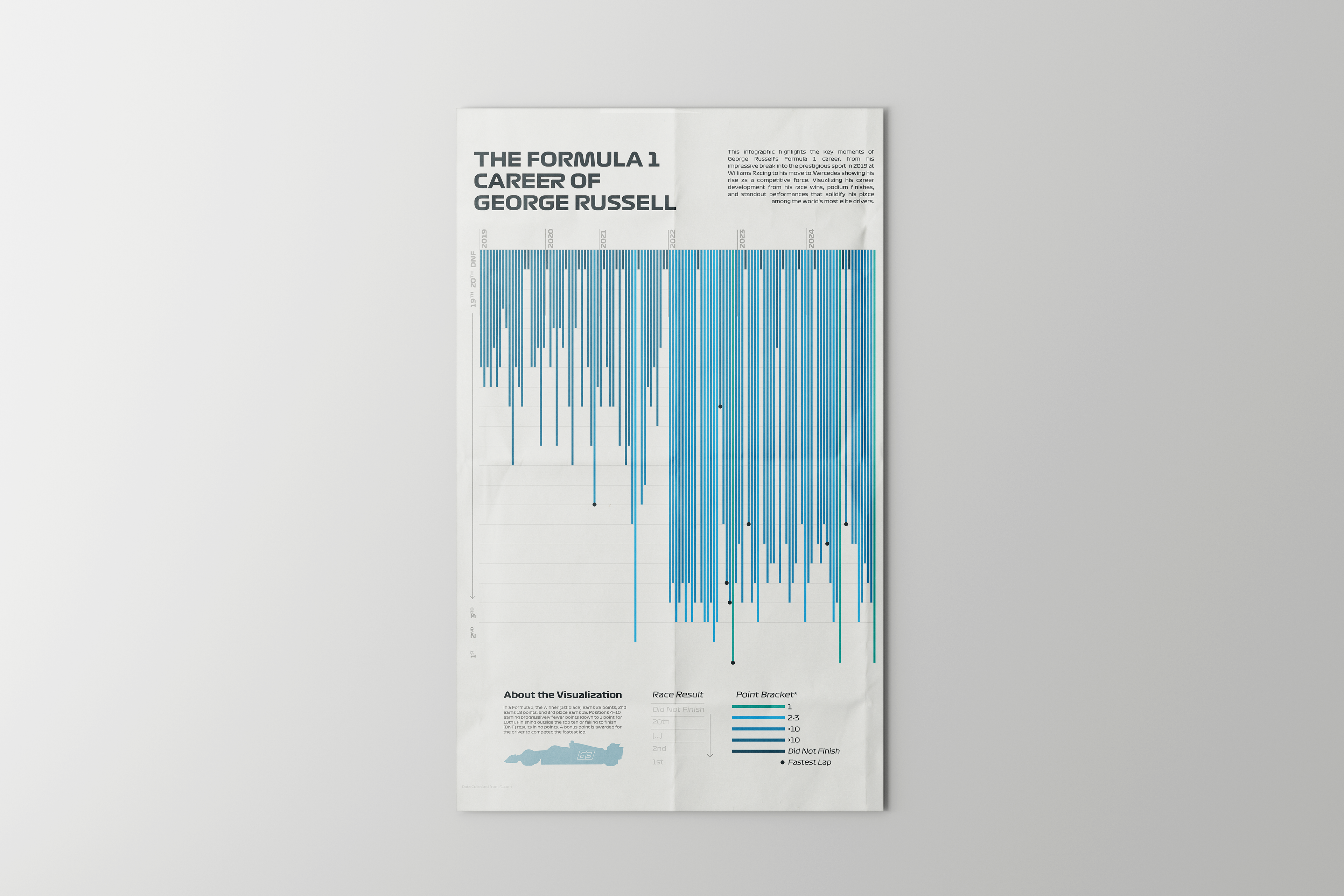
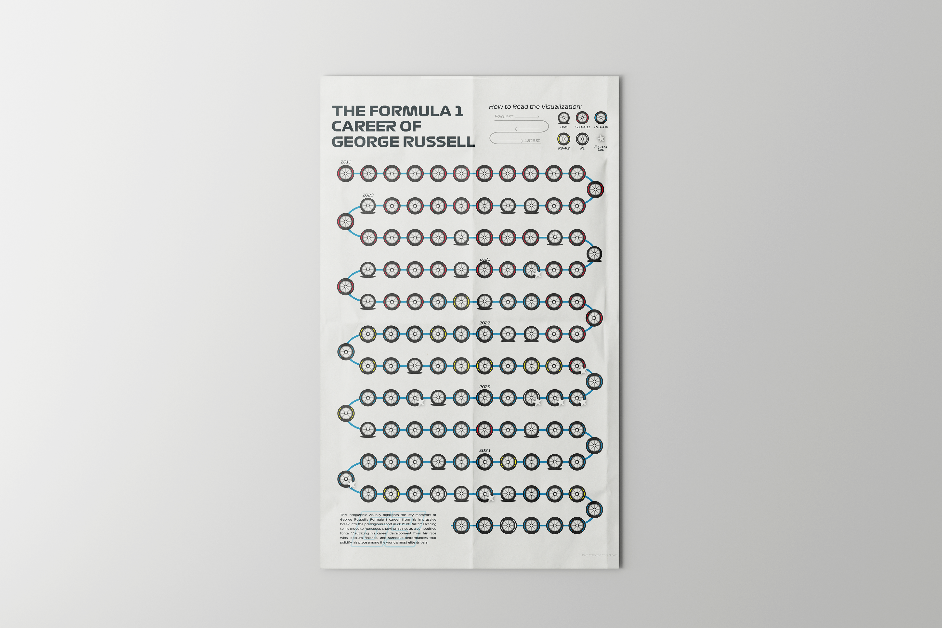
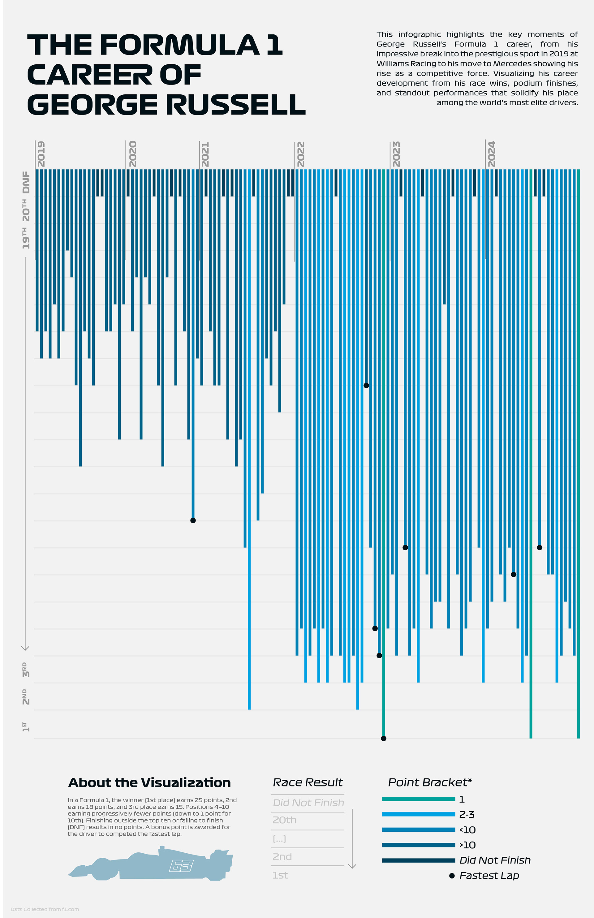
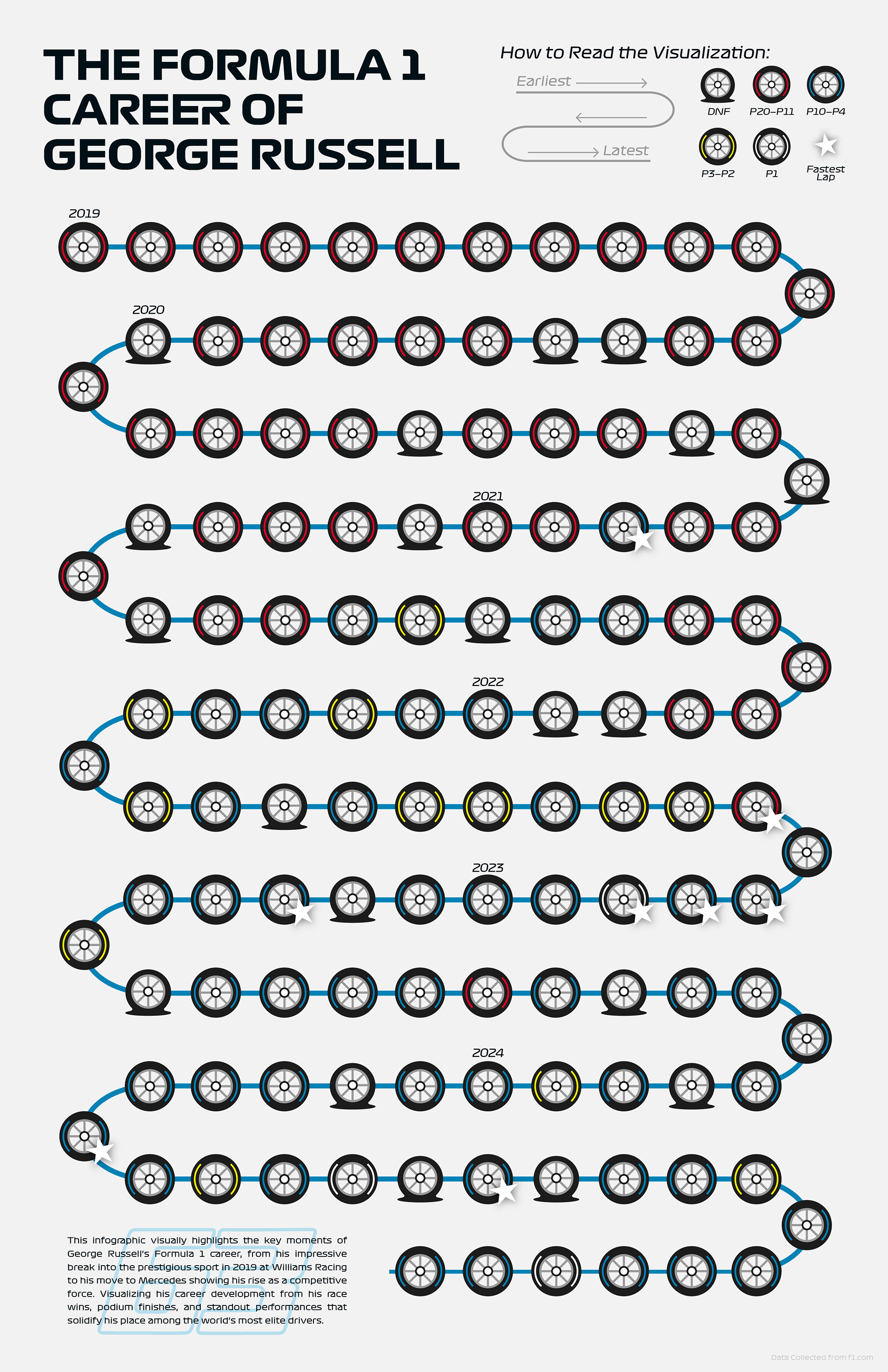
George’s Russell’s entire Formula 1 career thus far is summarized and displayed visually in these two infographics. Exploring data visualization design through the extensive and detailed data provided by Formula 1 on their website, I was able to produce my own spreadsheet to first combine all the necessary data. Prioritizing which information was most important to show, I developed two different visual designs to express the data. This allowed me to compare the difference between more formal and statistical design against creative and symbolic design options and their impact on the audience.
I found that the statistical, linear graph display created more of an impact upon first glance by truly showcasing a visual overview of the entire career. Not only was data neatly organized in this way, but it was easy to see the growth over the seasons and the progression without the need for in depth focus and analyzing of the infographic.
The symbolic display is more quirky and creative, however, I found that it isn't as easy to read and understand visually without focusing closely. It may be fun for a simple poster idea, but with the purpose to express data to an audience, this design makes understanding the information too much of a chore.
*as of November 2024