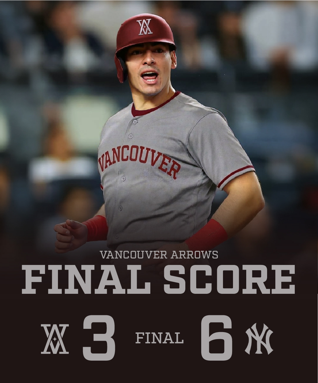

The newest team in the MLB is extending Canada's reach to the west coast. Vancouver, British Columbia is the proud home of the Vancouver Arrows. Breaking through into the rock-solid Major League required an undeniable brand that would come out of the gates fighting with demand to be heard and respected.
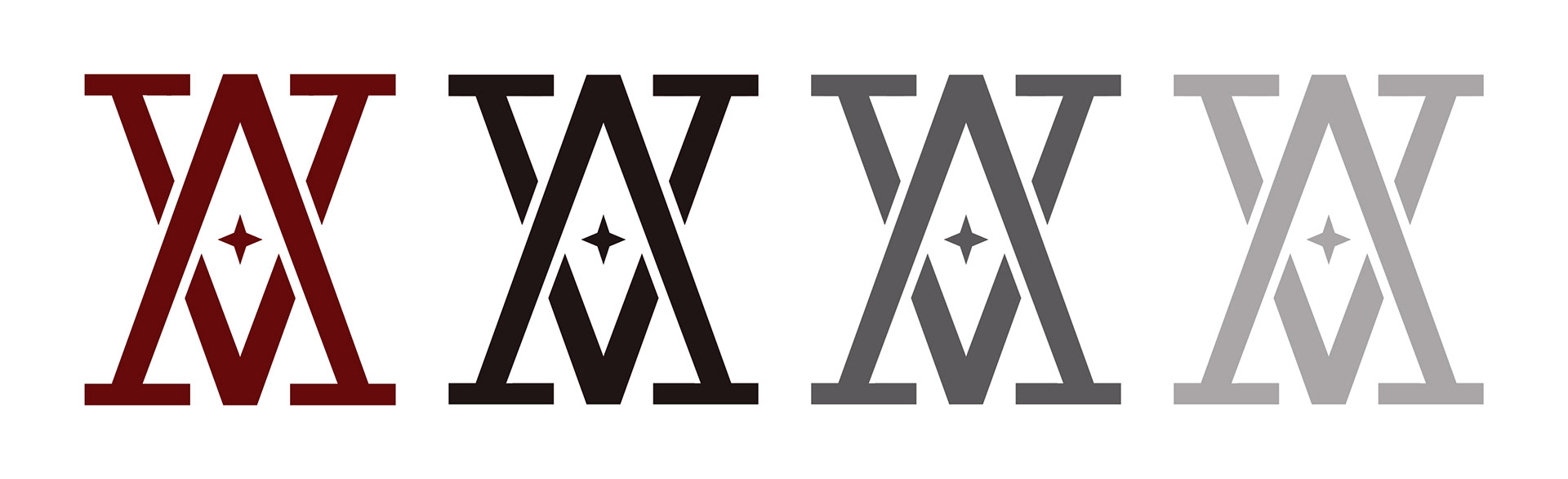
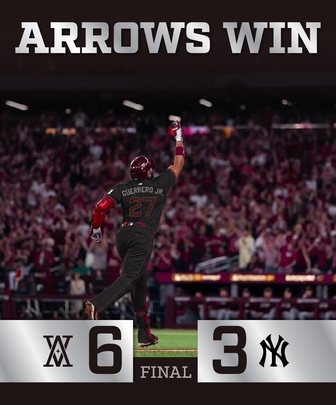
Their logo is sleek, modern, and sporty, fitting right into the crowd of their competition while still standing out as uniquely their own. The overlapping letterforms of the V & A make their logo undeniably theirs and easily recognizable to the public. Easy to recognize, easy to sketch, easy to apply to any jerseys, merchandise, or paraphernalia.

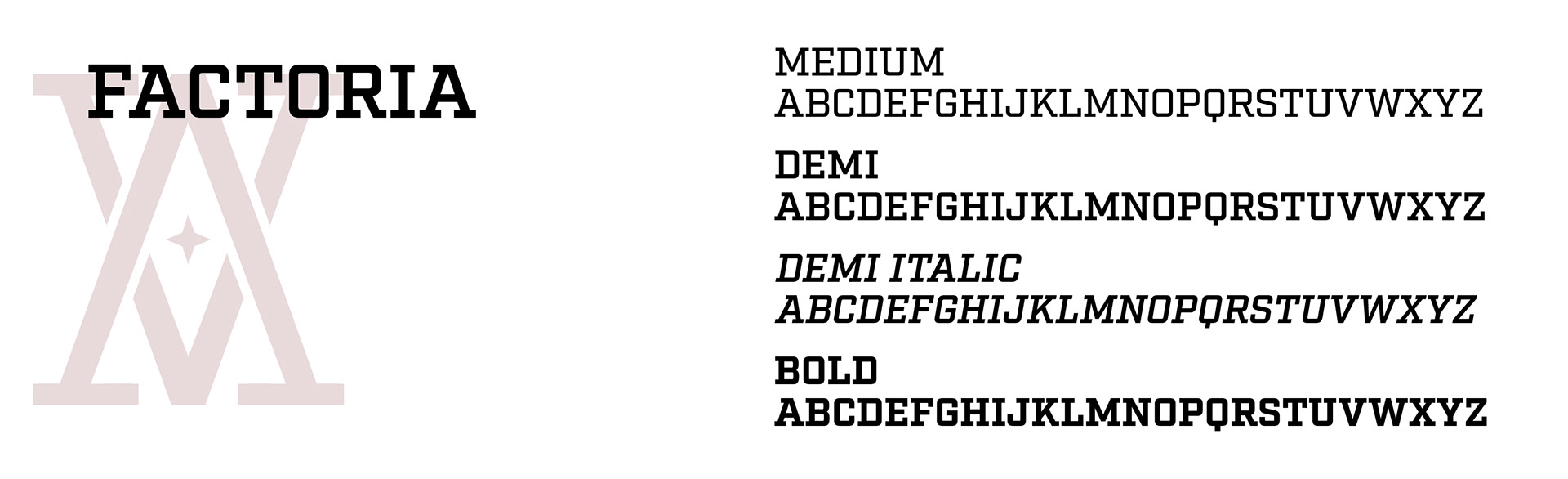
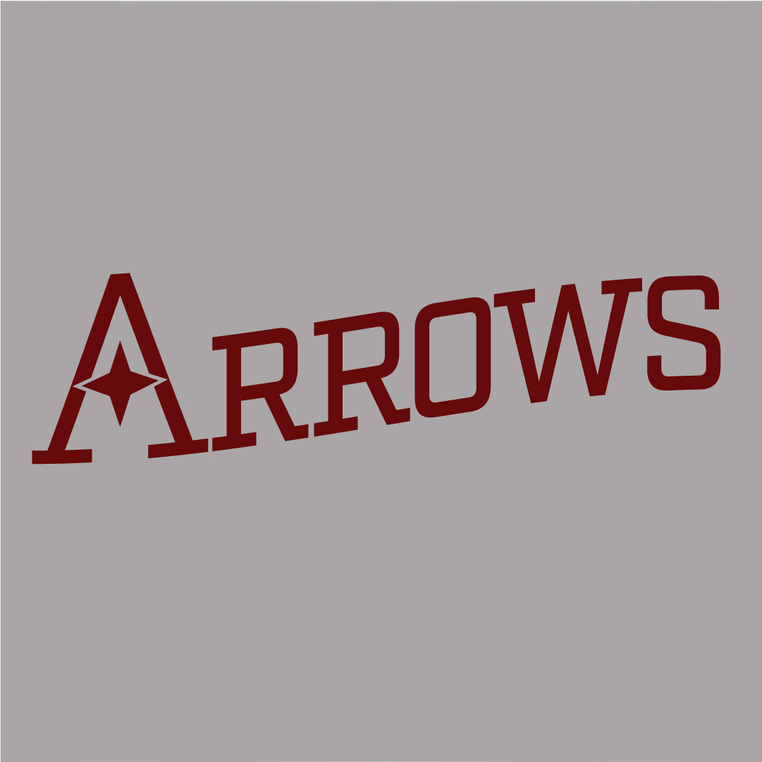
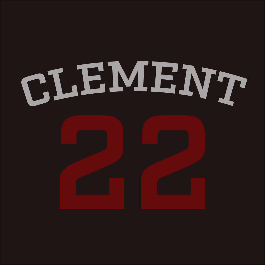
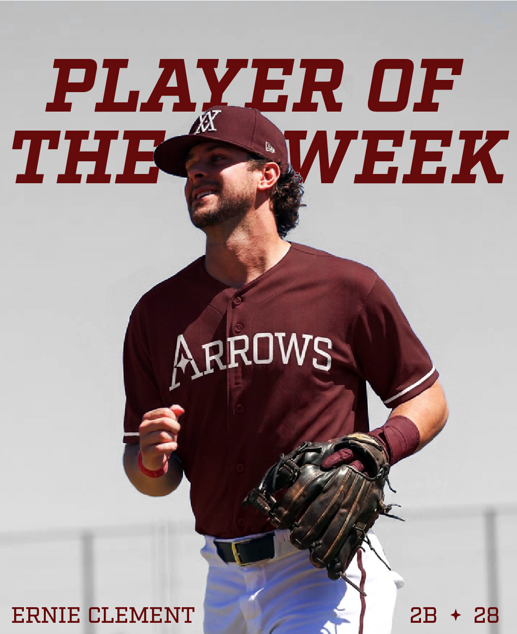
The chosen typeface is impressively sporty, reaching into the history and the roots of baseball with a font family that expresses just that. Straight, chunky, clean-edged letterforms capped by striking serifs grounds the brand in a solid, eye-catching base.


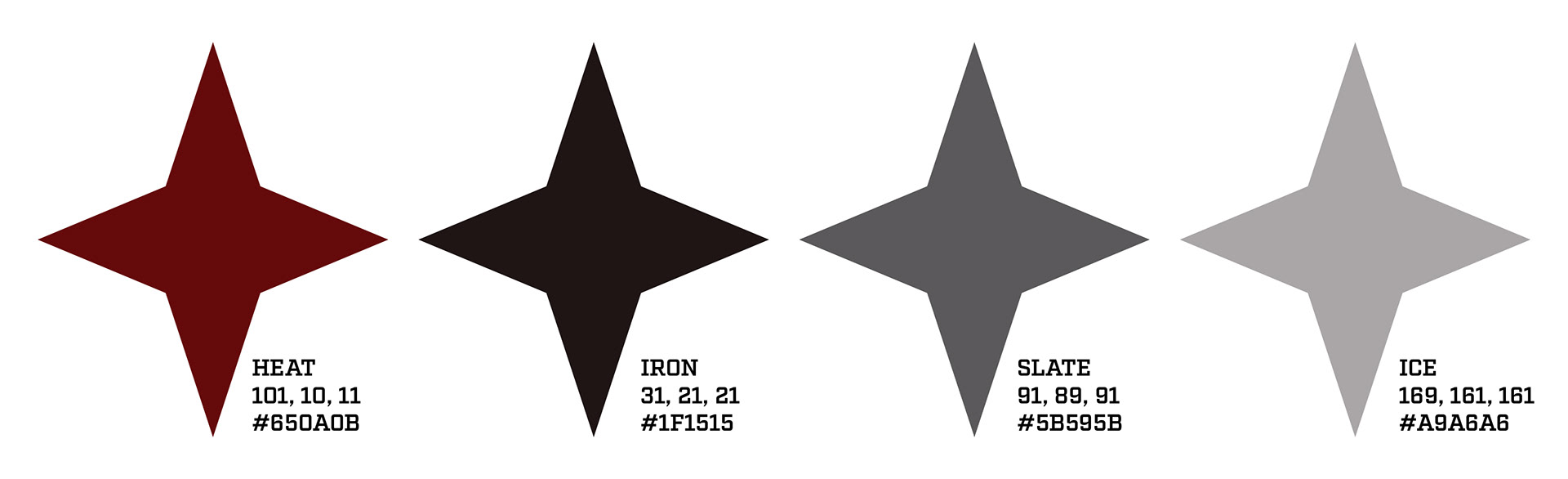
The colours of the Arrows paid homage to their Canadian heritage with its focal rich red. Although darker in tone than Canada's official colour, this shade allows the team to still stand out on their own with a touch of regality that comes with the deep, earthy burgundy. It is paired nicely with a trio of neutrals to give the primary red a canvas on which to come forward as the main focal point. These colours work together nicely to allow for any combination on jerserys.
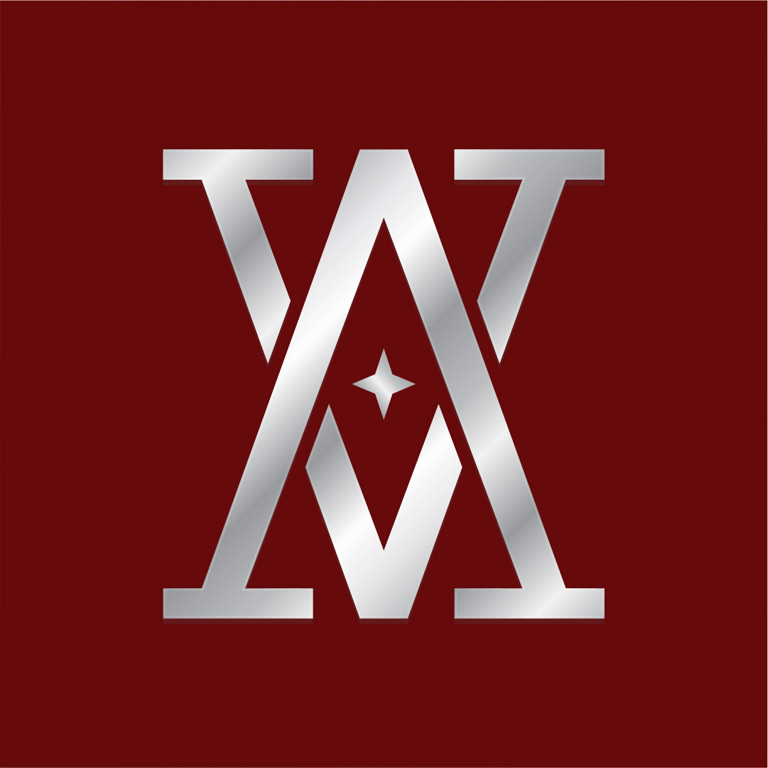
Steel details are also used sparingly to draw attention to important assets as required. The cold, hard, unrelenting presence of this metal detail is sure to capture the eyes of the audience and keep the Arrows standing out from their counterparts.