Meddows Interior Design and Decor was founded in 1970; when music and camaraderie was at the core of society. With a innate belief in creating spaces and pieces that last, Meddows has paved the way for mid-century modern design since it's conception, while keeping the classic styles relevant in the modern world. Meddows believes in timeless spaces built with care, craftsmanship, and soul. Spaces that are more than brick and mortar. Spaces that grow with you, that will last. Spaces that will tell your story for generations to come.
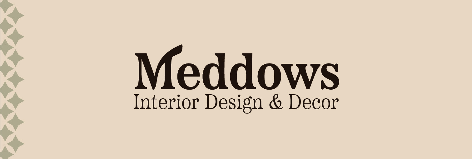
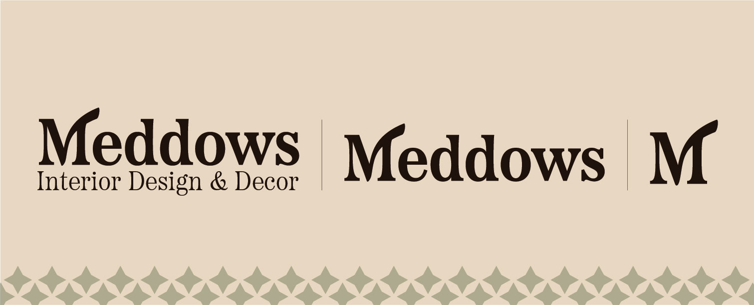
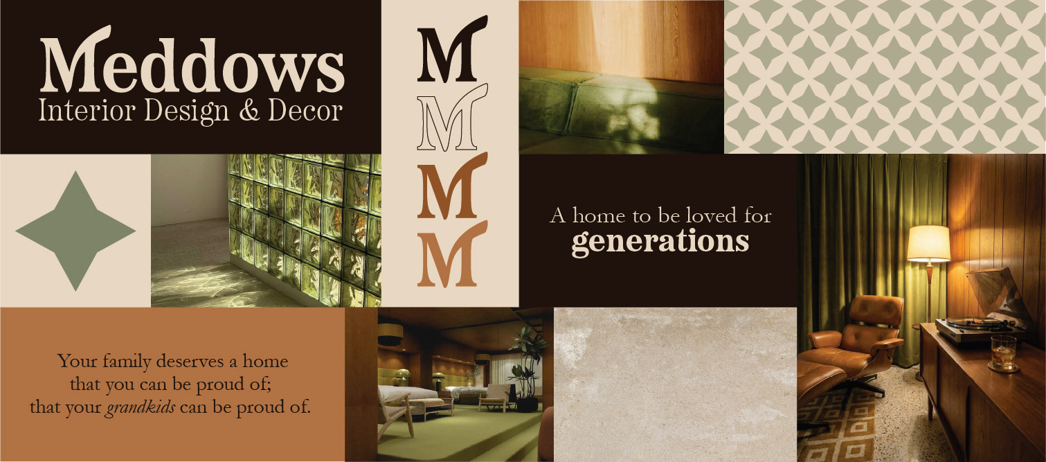
Logo
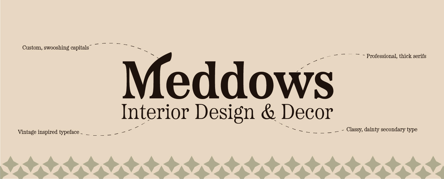
While the Meddows brand is instantly recognizable by its swooping “M” lettermark, the primary logo presents the full company name with the subheading 'Interior Design and Decor'. Careful attention has been given to the balance of scale and font weight, creating a refined and cohesive composition. For added versatility, the logo can also be used without the subheading, allowing it to adapt seamlessly across a variety of applications.
Typography
With thick serifs, classy letterforms, and an iconic swooshing M, Meddows' custom typeface was born from the original typeprint font styles. It's structured but relaxed, formal but flowing, captivating all that Meddows stands for in a few brief letters. It's signature M is easily recognizable and simply striking.
Colours
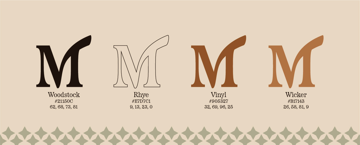
Inspired by the well-loved wood tones and earthy touches of mid-century modern design, Meddows' brand colours connect the interior space with nature, grounding yet not overpowering. The rich brown of 'Woodstock' and the creamy softness of 'Rhye' blend together to capture attention while the warmth of 'Vinyl' and it's adjacent 'Wicker' help to soothe the edges and create a sense of home. A secondary colour of low-opacity green is also present throughout the brand, creating sprinkles of interest when used sparingly.
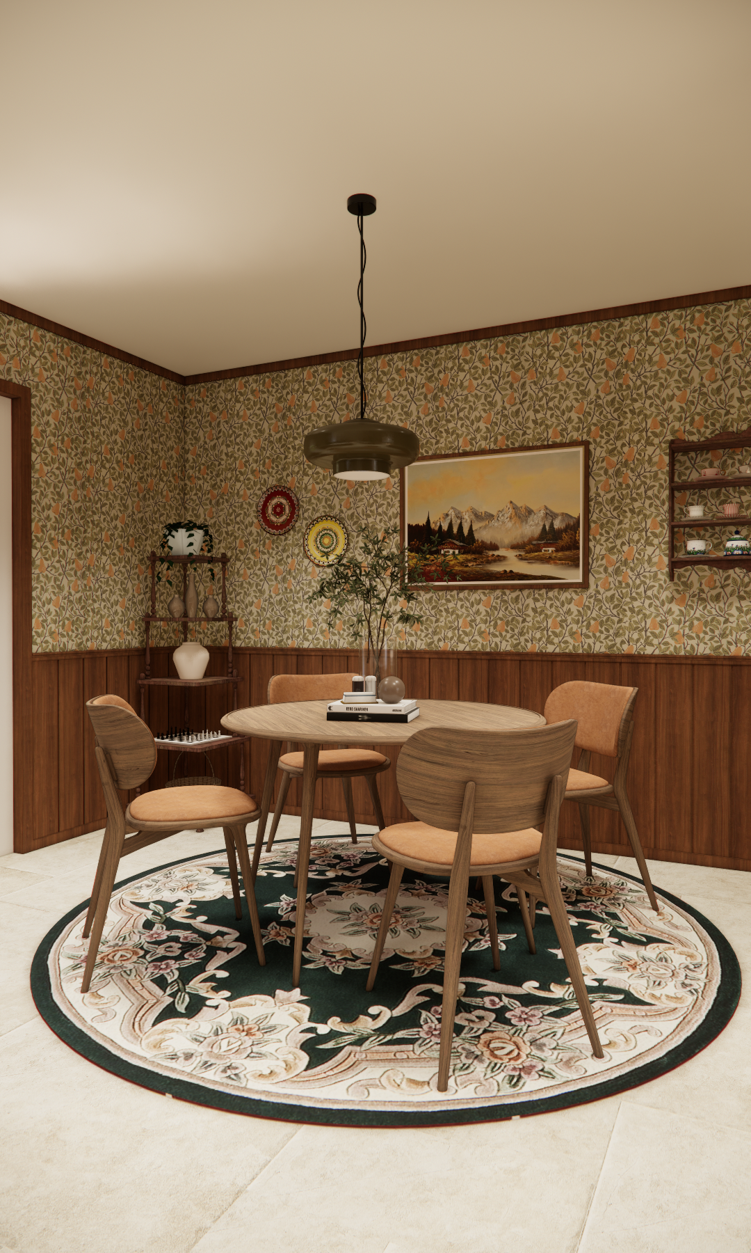
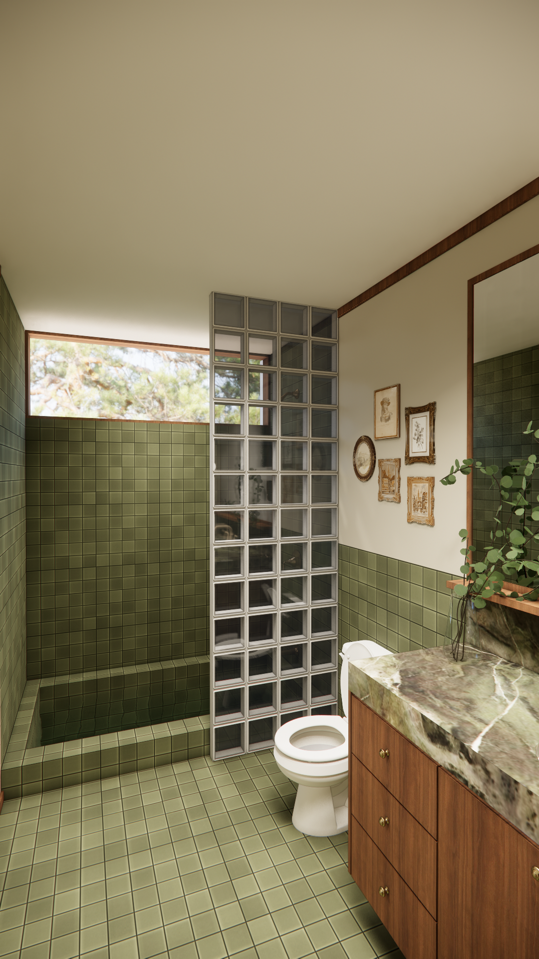
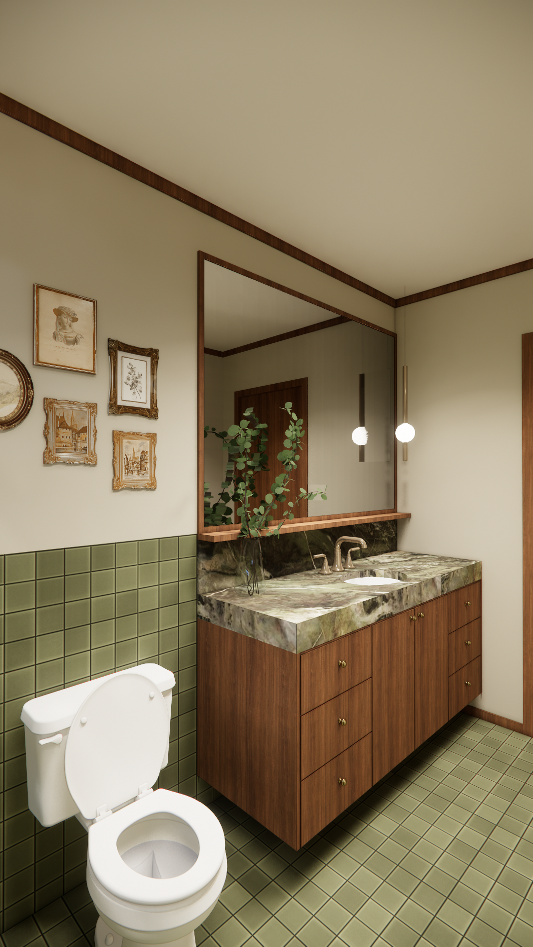
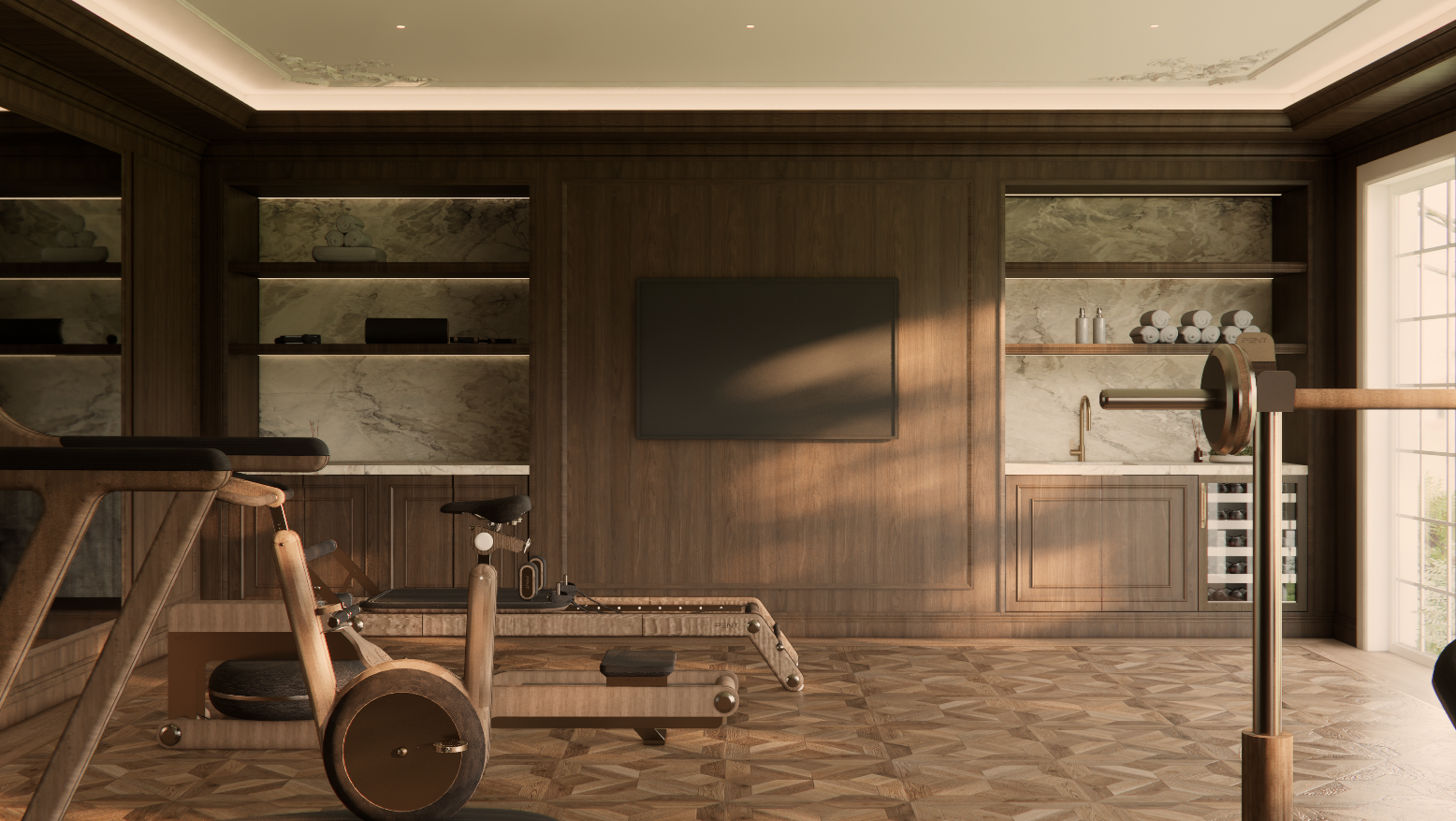
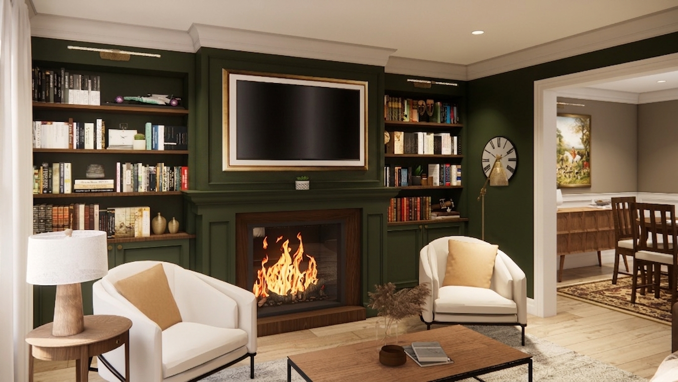
Photography
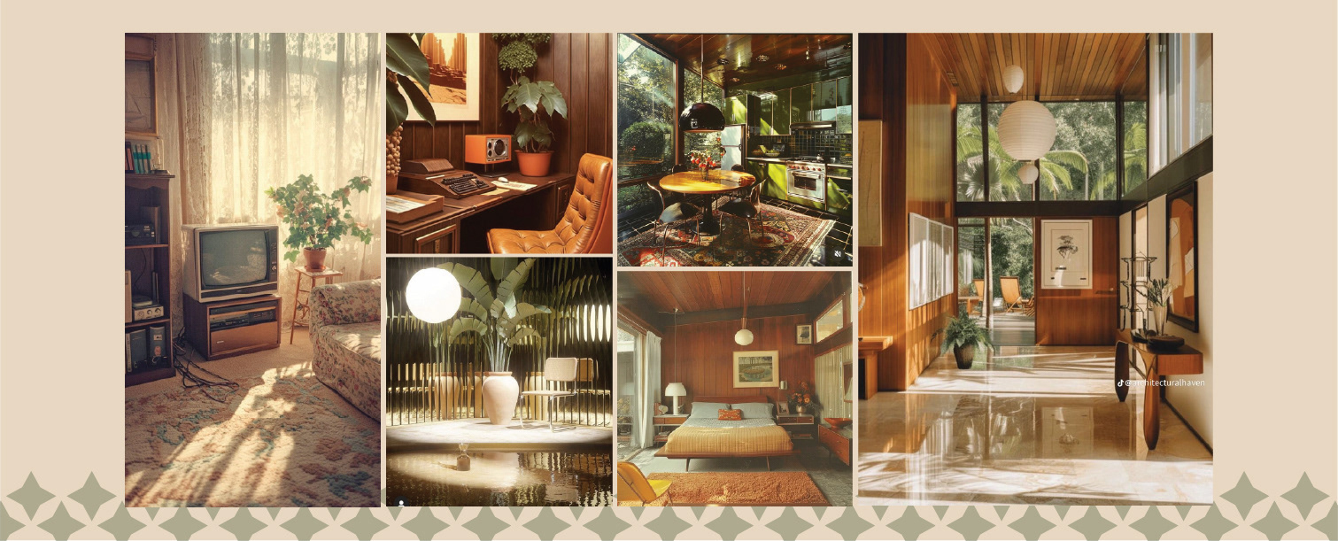
When capturing interior spaces, lighting plays a pivotal role in shaping the audience’s response. Meddows prioritizes photographing during peak hours of warm, natural light—when elongated shadows and golden sunrays enhance the richness of each environment’s colour palette. This intentional approach evokes a sense of nostalgia and familiarity, creating the quiet magic behind the work at Meddows. Every detail is carefully considered, long after the final cushion has been placed.
Interior Design Snapshots: